Wednesday June 16, 2021; 11:19 AM EDT
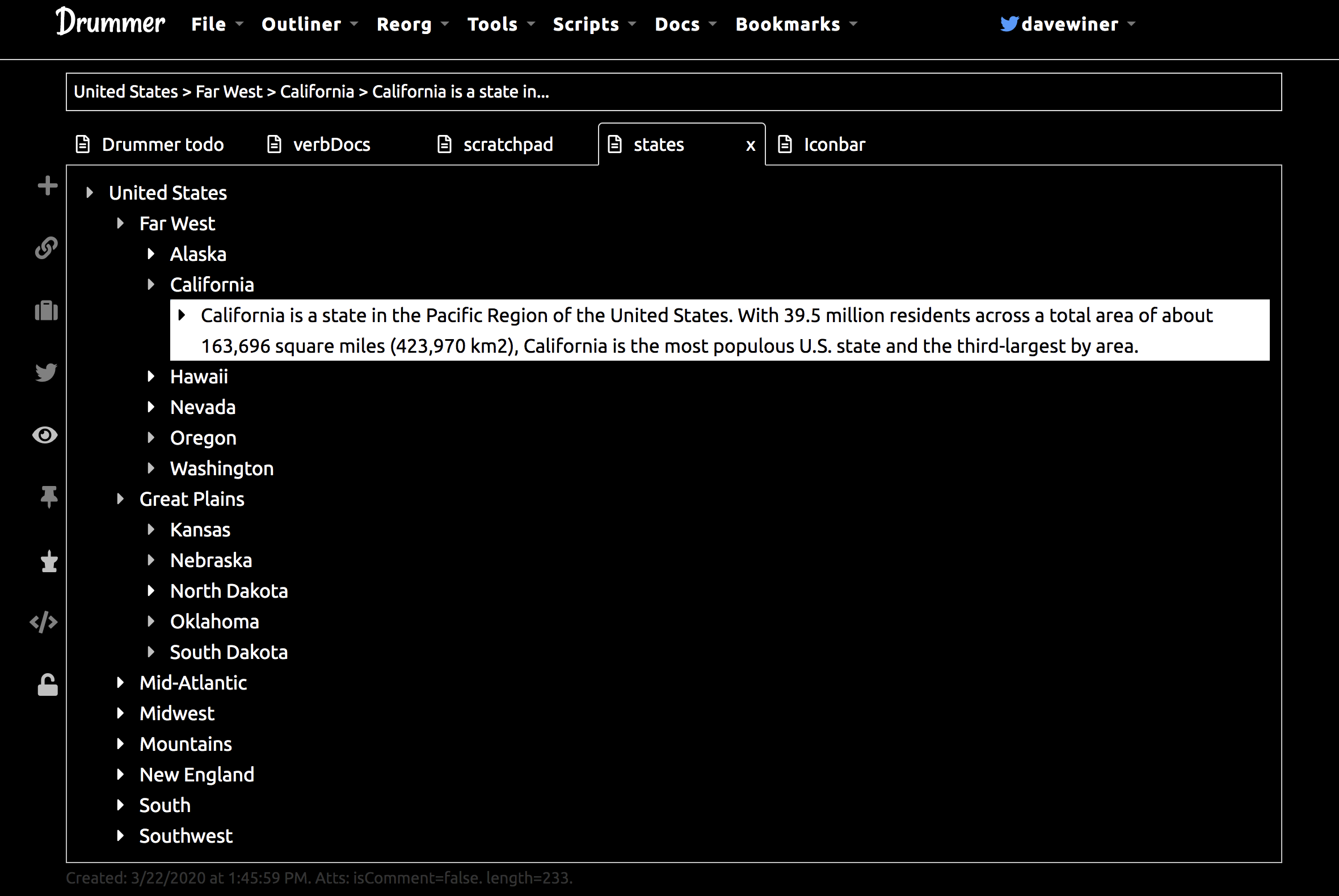
- I noticed is that most of the new outliners are dark mode apps. White text on black background.#
- Until recently it had never occurred to me that my outliner should have a dark mode too, so I've been working on that for Drummer in the last few days. Getting pretty close to having it working, then I have to go back and review everything to see if a bit of color here and there would be nice. I notice that other dark mode apps make use of color in an accenting way. I like that. You almost don't notice it until you look for it. #
- Let me just say CSS is the most awkward possible way to do this kind of programming. I yearn for QuickDraw, the UI tech we used in the 80s on the Mac. Everything was straightforward and done in a real programming language as opposed to CSS. #
