|
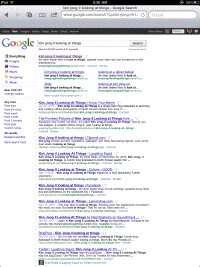
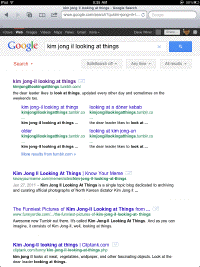
A few weeks ago all of a sudden, Google search changed the way it works on the iPad. Here are two screen shots that illustrate the difference. The first is the normal view of Google search in a normal web browser. The second is what we get on the iPad.
Yes, there is a link at the bottom of the screen that gives you the higher density "classic" view. But please Google, give me a permanent preference so I never have to look at the mobile version again. I gave it a few weeks and I still hate it. And one more time, an iPad browser is a regular browser. It doesn't need any fancy tricks to make it work like an iPad app. The reason we're choosing to use the browser and not the app is that we prefer the browser to the app. Come on software guys, design for your users. Also, it's conceivable that Apple could help us out and give users a pref that tells websites that we're not using an iPad, so we get their normal version. Technically, it would be very easy to do. |

