Poll: Which political party will control "truth" on what remains of Facebook after the politicians get through with it.#
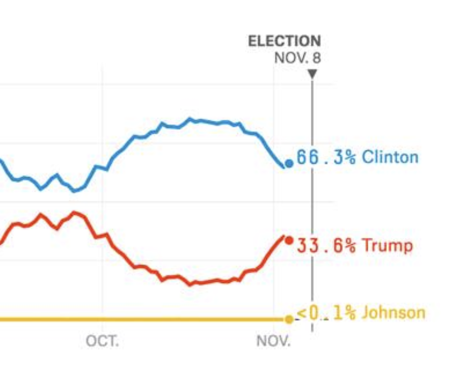
 As the 2016 election approached, FiveThirtyEight published a series of graphs showing over time the likelihood of Clinton or Trump winning. All through October, as Clinton gained confidence, the two branches of the graph diverged, until FBI Director Comey's letter to Congress. I watched it live and my heart sank. Here we go again. Hillary's Emails. That evening, Clinton gave a speech. Eleven days before the election. Voting is already underway. We understood the damage. And you can see it clearly in the graph on this day in 2016. Yes, Clinton was still twice as likely to win as Trump. But the graph was going the wrong way. And we know how it turned out. So remember, the story that the NY Times invented, promoted with love by the FBI and the rest of journalism, was probably a bigger cause of America's defeat than Cambridge Analyitica and Facebook. But of course the NYT controls the conversation, and is unaccountable, so the blame is focused elsewhere. #
We need a C-SPAN for the web. Not archive.org (which is great). A place where you can put things on the record, so when something notable happens you can be sure this will be the last place to disappear, or to be put behind a paywall.#
I try to ask questions political journalism would ask if it were tech-aware. And the other way around. There's an intersection that is mostly missing. The enemy has been investing there. And enemy is the right word.#
You mean journalism is licking their chops. “Hillary’s Emails” was fake news created by the NY Times. We haven’t forgotten. This is the corruption of American journalism. We never got an apology from the NYT or even a mea culpa. It isn’t the first time NYT fuckery cost us huge. These people are drunk with power, and are accountable to no one.#
It was obvious that the Warriors were going to crumble if not this year next year. Dynasties in the NBA are pretty complete unlike other sports, and the teams on top get bored. Winning it all meant something the first time, maybe a bit the second but after that it gets tired. We saw it happen first with the Miami Heat. #
 A couple of years later, I've yet to see a JsonFeed in the wild. And if such a thing existed, I suspect there would also be an RSS 2.0 version of the same content. In the group where developers discuss it, which I follow, most or all of the feature requests are things that have already been done in RSS or Atom.#
- There was, provably, no reason to do this. At this point, is there a language or environment that doesn't have an open source library for reading feeds? It's just one call in my JavaScript code to take a bit of text that's supposed to be a feed and get back a JavaScript structure with the contents. Couldn't be simpler. Yet I don't think many of those libraries include support for this two-year-old format. So you have to do more work to read it. One of the goals of the new format was that it would be less work. #
- And on the writing side, maybe writing JSON is a little easier than writing XML, but again, if 20 years after the advent of RSS, you don't have a toolkit in your environment to write feeds, you should probably do it yourself and share it with other devs. #
- Finally if you were going to invent a new format why not just JSONify an existing feed structure. I did that for RSS in a few minutes. My blog is still available in JSON as well as XML. No need for debates or feature requests. It's RSS but in JSON. It Just Works™. Not that anyone uses it, for the reasons mentioned above. #
- I've known both Manton and Brent, the authors of the format, for many years. Nice people. But this was a mistake. Atom, also, was a mistake. All the energy should have been focused on a standard that would be supported everywhere, as easily as possible. I did it myself. I had designed a format when RSS came along, from Netscape, and I dropped it in favor of RSS, because one way to do something is better than two no matter how much better the second way is. A hard-won lesson from many times around the loop. Hopefully this is something will not be repeated for RSS at least, in the future. #