 Wall Street protest this evening
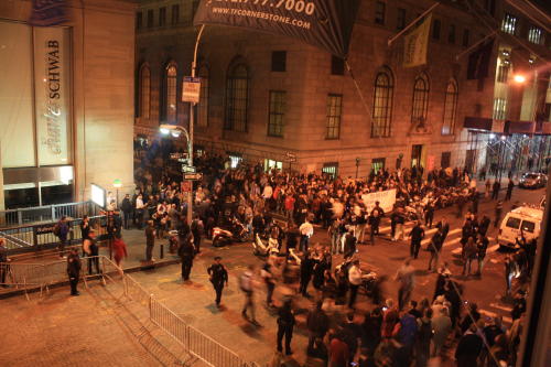
We haven't found a window overlooking Zuccotti yet, but we do have one with a fantastic view of Wall Street.
This picture was taken by Evan Fogel earlier this evening, of a march on Wall St with lots of NYPD presence.
Click on the photo for a closeup view.
 Alternate renderings of Scripting News
 In comments under my last tweaks post, I admitted that this is all part of a conspiracy, like Tom Sawyer with the whitewashed fence, to entice developers to create alternate renderings of Scripting News.
That may sound fun evil, and it is, but possibly not the way you think. Sure, I want my blog to look great, and I want everyone reading it to have it look exactly the way they like it. But I also want to be able to organize my reading of other blogs myself and have it all look beautiful, the way I think beautiful looks. I want to use new tools to read them. Tools written by Marco Arment, Rich Ziade and Joe Hewitt. (You see I even know the names of the developers I'm trying to lure into this trap.) And of course any wanna-be Marcos, Richs or Joes. And of course the Flipboard guys would benefit too if this all worked.
So I could publish all the text and structure on this blog in JSON, but I already publish it all in XML. If you poke around in the source you'll even see it. Or in the RSS feed. The hints are there.
It's like a puzzle diabolical plot to take over the world! ![]()
Mwahahahaa!!
 Cold-calling Dennis Ritchie
When I was a grad student at the University of Wisconsin in 1978, I called Dennis Ritchie at Bell Labs to tell him about the work I was doing with the Unix line editor. I had added structure. You could nest lines under other lines. Dive and surface. Move a line up and everything under it would move up too.
I also built a parser into the editor so it would understand the structure of Pascal (for some reason I chose Pascal and not C, I don't remember the rationale). So you could import a bunch of code and it would automatically arrange it into a hierarchy that my editor could edit.
He was really gracious, asked a bunch of questions about what it was like to use. The questions indicated that he understood what I was describing.
I got off the phone with a glow. For a student to connect with an adult that way, especially a hero like Dennis Ritchie, whose code we were studying, whose coding style was what I aspired to -- that was a thrill. Of course I still remember the feeling even if I don't remember all the details.
I mention this today because Ritchie died recently.
I read somewhere that, while he wasn't as famous as Steve Jobs, that his legacy was on the same level. I totally agree. He created the modern interactive operating system. He taught a generation of programmers, of which I am luckily one, how to think like a programmer. That loving code was exciting and rewarding. And he did this all by sharing with everyone the results of his own creativity, totally. Long before "open source" or "free software" were rallying cries.
I just wanted to say Thanks! and that I aspire to pass on whatever I can from what I learned from him.
 More scripting.com format tweaks
 James Burgos suggested that I change the linespacing from 150 percent to 130 percent. So I tried it, and felt that it was too smushed up for my reading pleasure. How I feel about this is important because I read this stuff way more than most people do. Over the course of a few hours after publishing a piece I read it over and over, looking for ways to tighten things up, to make my ponts more persuasively and looking for more interesting or elegant ways to say things. Not all pieces of course, but the important ones -- like yesterday's politics piece.
So I kept fiddling, as I knew I would. ![]()
Ended up changing fonts again. Now the text is Georgia, hopefully a font that everyone finds readable. And the structure text, titles and navigation, are in Ubuntu. I really like that font. It's a good substitute for Arial or Helvetica, it seems. But it's got a little style that those fonts don't have. A certain I don't know what. ![]()
Then, to achieve the effect that James wanted, I wrapped each home page item in a new div, so now it's easy to add space above and below each unit on the home page, without messing with the styles of the components.
Now I'm overall fairly pleased with the way the text looks.
Still have to decide what to do about the plus icons on the home page, and maybe do some more to make the linkblog stuff look more like a linkblog.


